

ZEBRA JANOTA
ZEBRA JANOTA
CONSULTING SERVICES
BRANDING / DESIGN
ABOUT
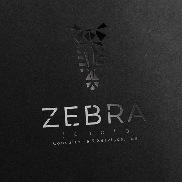
Branding for “Zebra Janota Consultoria e Serviços“.
For the development of the logo and identity we had as the starting point, the multiplicity of interpretations around the zebra imagery, and after some research we chose to make an approach to a more ethnic perspective, or language where the zebra is seen as a symbol,
“Zebra Janota” or “The Fancy Zebra” provides flexible and reliable logistics services while maintaining a relationship of trust with their clients, employees and partners, and those were some of the values we wanted to infuse on this brand identity, thus the use of straight bold lines and a refined and direct design, as well as the use of a classic “Black & White” conjugation for reinforcement of the brand’s credibility and transparency.
Referring to the brand applications, we developed the design for greeting cards, letter paper, folders, pens, and other stationary for the company.

STEP 01

STEP 02

STEP 03
