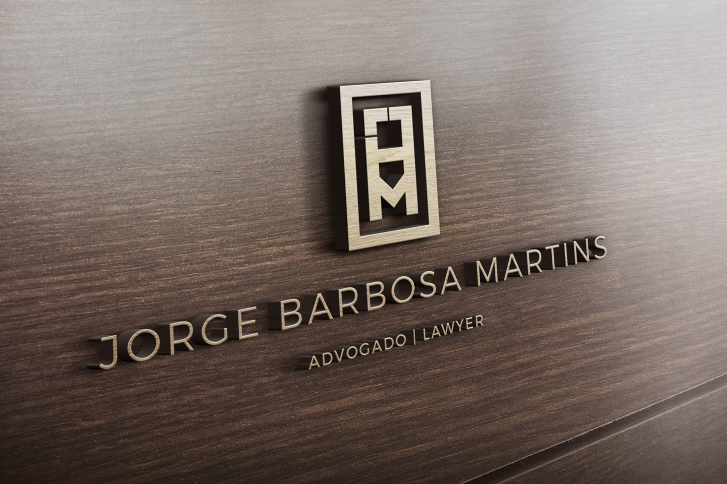
JORGE BARBOSA MARTINS – LAWYER
JORGE BARBOSA MARTINS
LAWYER
BRANDING / DESIGN
ABOUT
Jorge Barbosa Martins – Lawyer identity was created using only straight lines, aiming to embed the concepts of integrity and vigour on the brand. Seen as a whole, the logo is based on an aligned geometry, which provides us with the connotation of the wits and knowledge commonly associated to the practice of law.
One of the logo’s traits, it’s the shape that came as a reference to the Greek columns, which we tend to associate with the origins of justice and democracy, once again their use also reinforces the brand with the concept of stability and strength.

